Design & Build
On a tight schedule, we tested early and often. User feedback drove every iteration — and as lead developer, translating that feedback into interaction logic became as important as the code itself.
Clarity Over Conventions
When a user tested our interface, she said: "Mock Interview or Practice Interview — which is which?" She'd studied for IELTS and knew the mental difference instantly: "Practice Mode" vs. "Practice Questions." We renamed and restructured the labeling. Small change, enormous clarity win.
Feedback Visibility
Early hover states were too subtle — just a box shadow. One user said the grey color made it look "unfinished." We standardized all button states to use color shifts instead, making interaction feedback immediate and clear across the entire app.
Loading States Matter
A user clicked "next" on the file upload page and nothing happened. She didn't know if it was broken or loading. We added explicit loading indicators. Now every async action has visible feedback, so Marco is never left wondering.
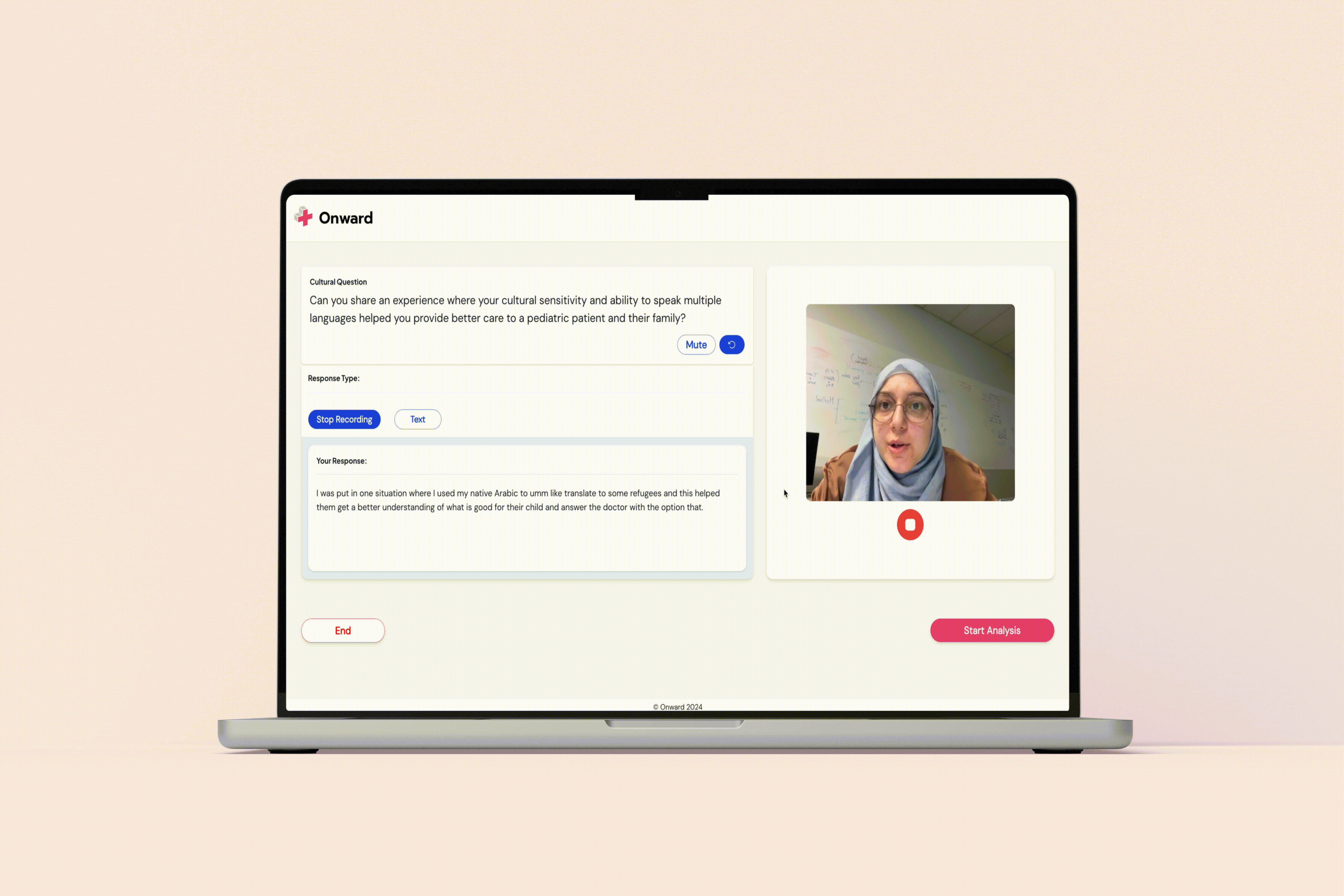
Timer UX: Pressure vs. Practice
Users told us they wanted to practice without the countdown timer's anxiety. So we split the logic: practice sessions measure time but don't count down (for low-pressure drilling), while mock interviews are fully timed (for high-stakes simulation). This single insight changed how we thought about the feature.
Consistency Signals Confidence
Button sizing was inconsistent — some large, some small. We standardized them. Hover states differed. We unified them. File upload labels were vague. We clarified them to "Select file to upload." Each small consistency win reinforced the emotional message: "This app respects your time and knows what it's doing."
One user rated ease-of-use 8/10. She loved seeing the question preview before answering. She loved the final analysis mockup. These weren't accidents — they were the result of testing, feedback, and iteration.