Project 01 — Integrated
feeds
A brand identity, the guidelines that made it repeatable, the product front-end it was applied to, and the booth it launched from.
The work
One system, seven surfaces
Feeds is a self-hosted reader and digest engine for developers — one Go binary, a local database, no accounts and no telemetry. I didn't write the engine; the developer I worked with did. But more or less everything you can see, I made: the identity, the guidelines, the applied front-end, the digest email, the marketing site and the whole launch.
01 — The launch
It had to hold a room
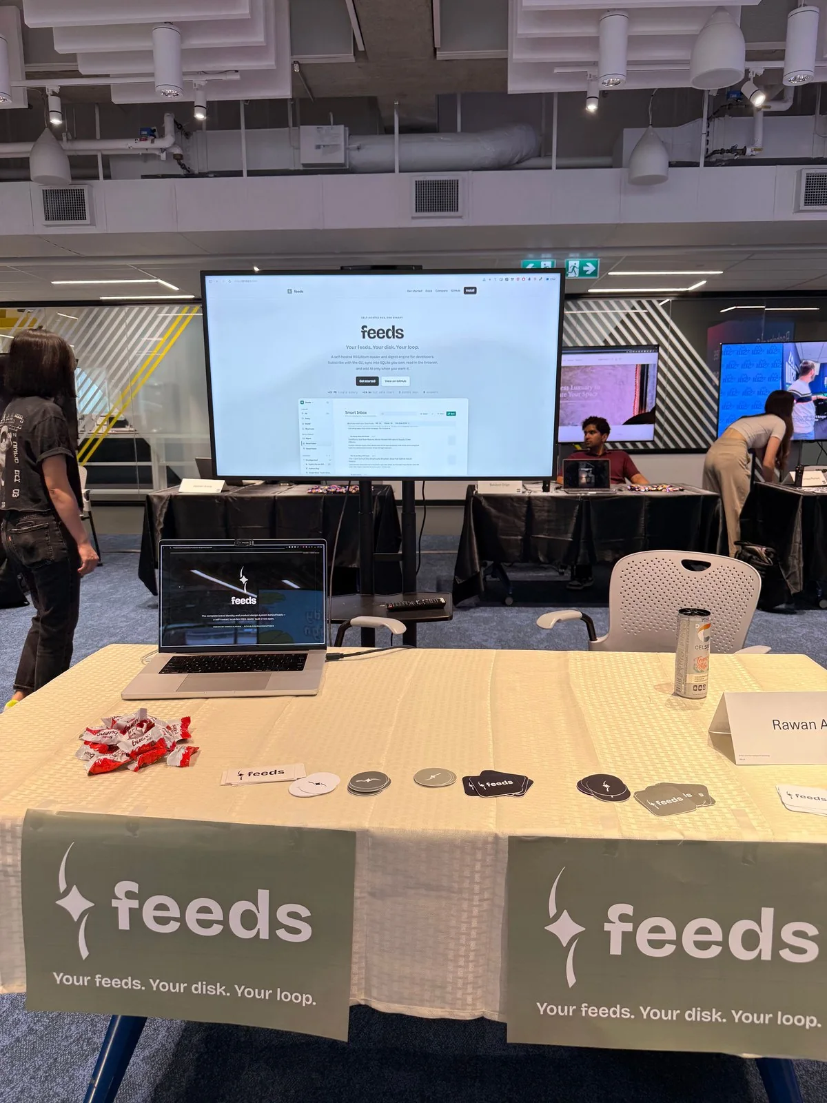
Feeds launched from a live booth at the capstone showcase. A booth is the hardest test a young identity gets: it's seen from three metres away, in bad light, next to twenty others, by people who will not read anything. Everything on and around that table came out of the same brand kit.
The reel from the screens — the product, cut to read at a glance.
02 — The identity
A spark, held
A four-point spark framed by two curved strokes — the signal, and the loop that catches it. The wordmark is lowercase Bricolage Grotesque, never capitalised and never reset. The lockup flexes across backgrounds, but only in three approved combinations.
 On paper
  On ink On sage
 Three approved combinations. Everything else — recolouring it, tilting it, stretching it, or dropping it where contrast falls below AA — is one of the four named don'ts.
The palette
Paper and ink, with one signature sage. The point of specifying it this tightly wasn't restriction — it was so that sage stays an accent instead of drifting into a background colour the first time someone reaches for it.
The guidelines
Eleven pages, written for the person who'd be applying it without me: construction and clear space, the three approved lockups, four explicit don'ts, the palette down to the ratio each colour should occupy on a page, a five-step type scale on one variable font, fifteen custom icons sharing one grammar — 2px strokes, no fill, rounded joins, one grid — three supporting textures, and an AA contrast floor that isn't optional.
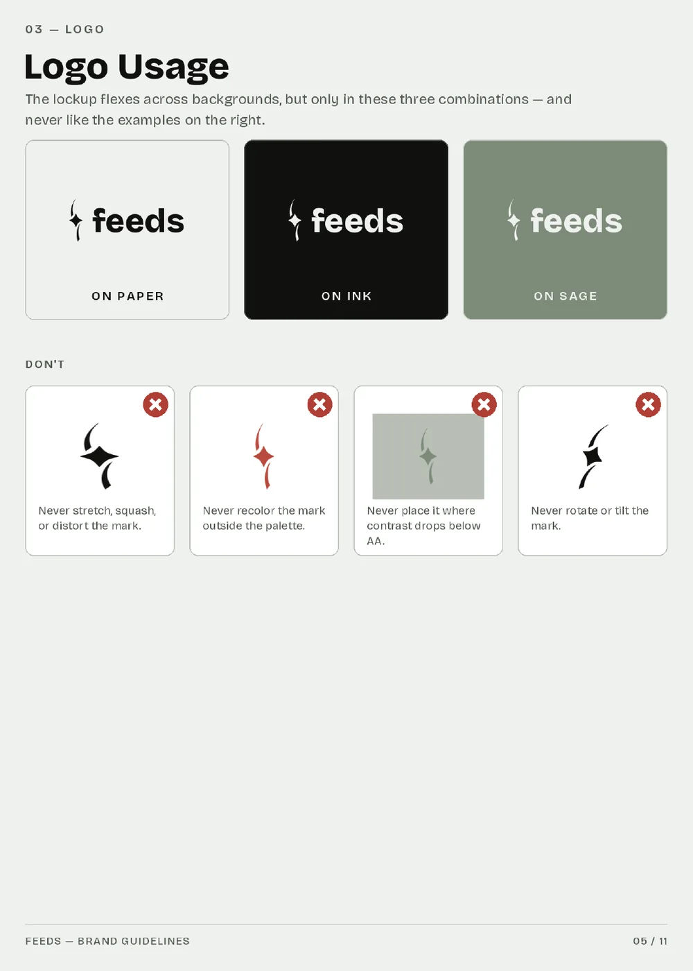
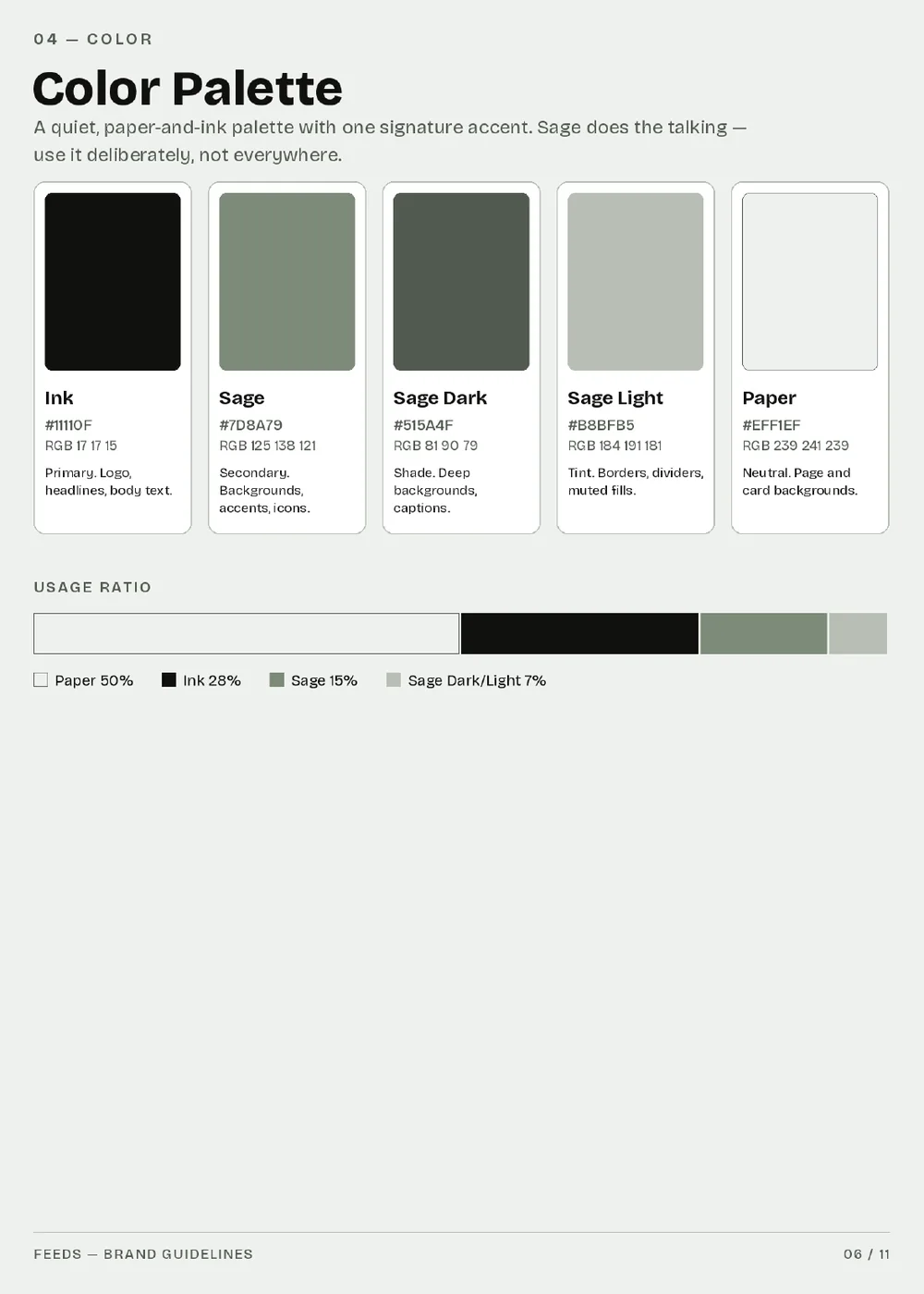
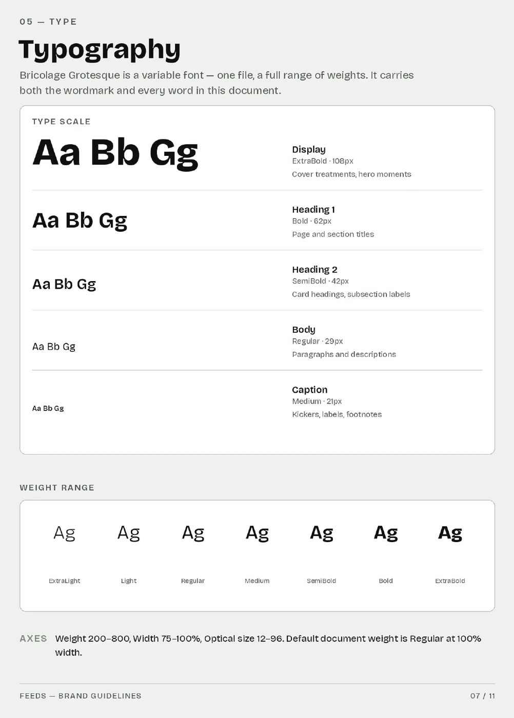
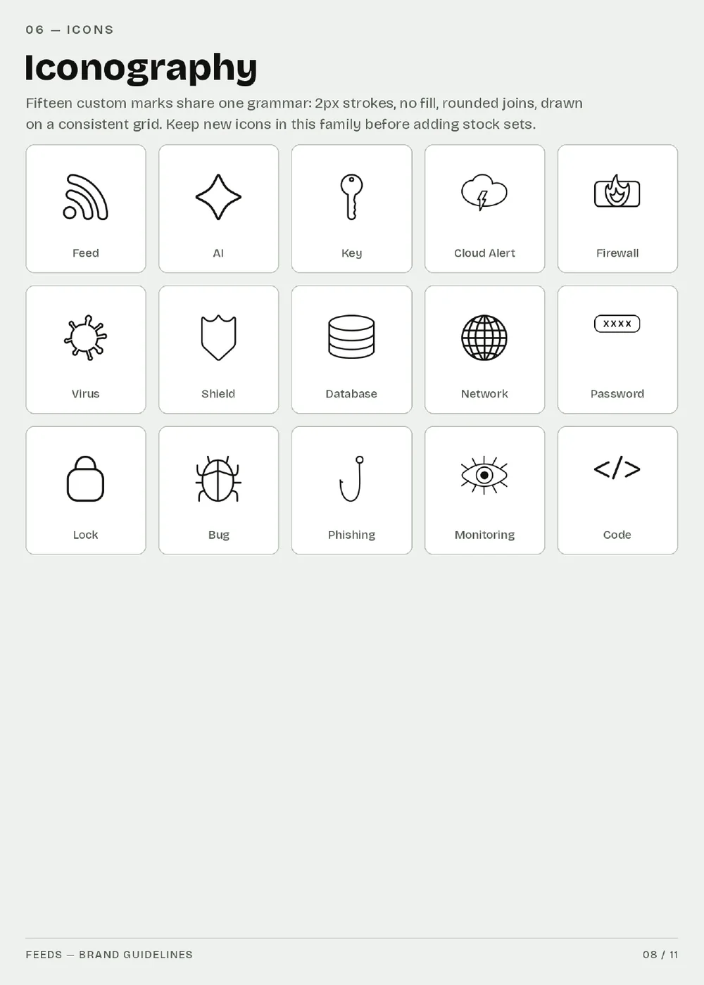
Four of the eleven pages: logo usage, colour, type, icons.
Motion
A ripple built from the mark's own curve, for transitions, loading states and hero backgrounds — so the brand has something to do while the product is thinking.
Ripple, from the brand kit's motion set.
03 — Into the product
I applied it myself
A guidelines PDF handed over at the door tends to survive about two weeks. So I took the system into the codebase and applied it in CSS and JavaScript — the interface, the icon set, the Smart Inbox navigation — and left the result as the reference implementation.
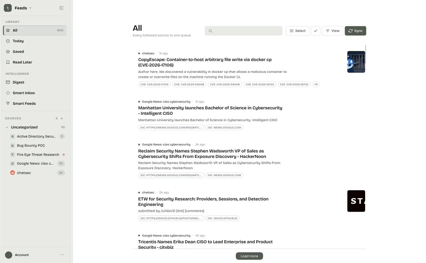
The article list — inline CVE, malware and actor chips.
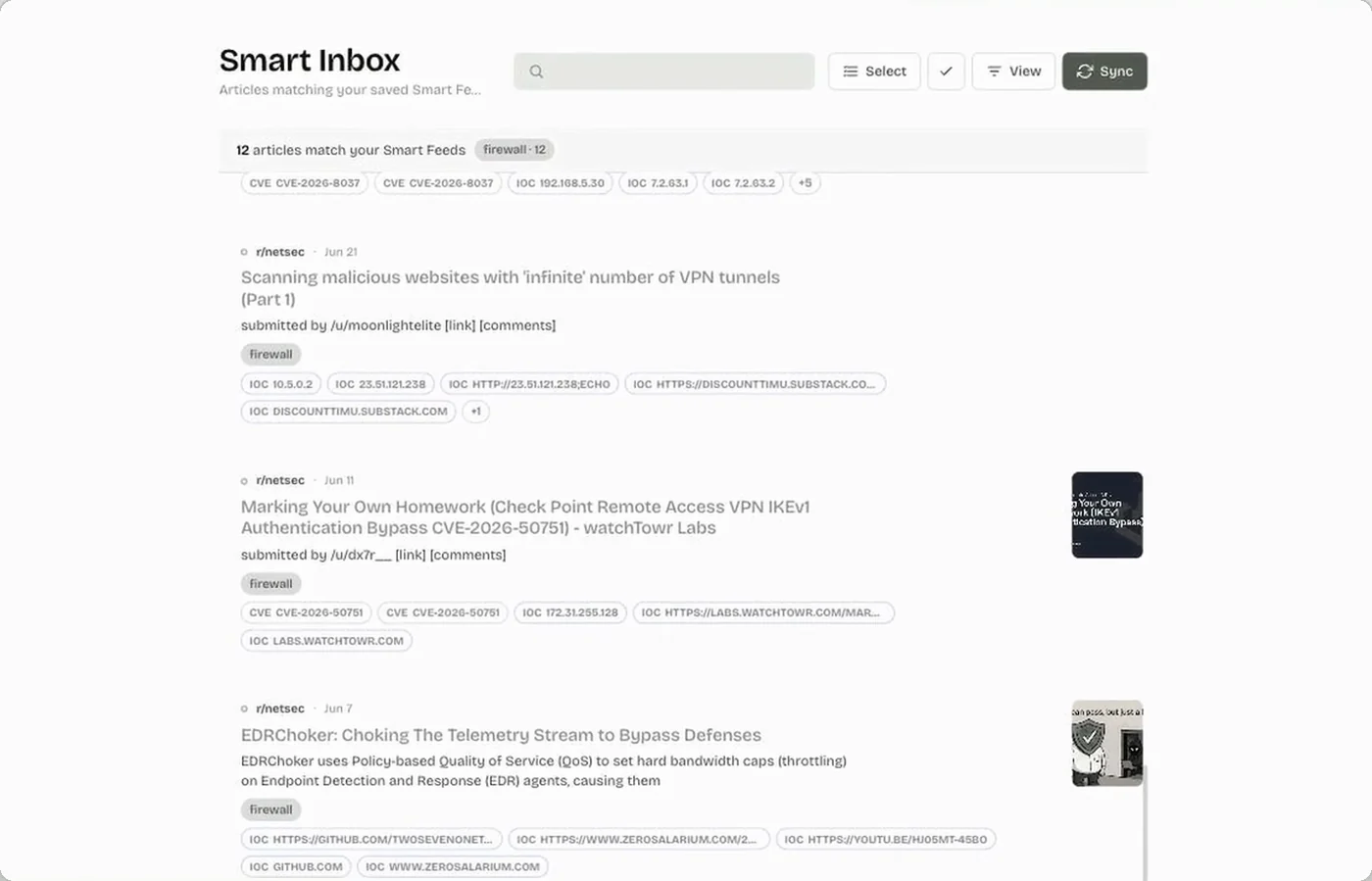
Smart Inbox — saved filters, restyled against the system.
The product demo, re-recorded against the new UI — it's what runs on the marketing site and in the README.
04 — Outward
The same system, everywhere else
Once the product carried the identity, everything pointing at it had to agree: the marketing site, the digest email that lands in someone's inbox every morning, and the README that is, for a developer tool, the actual front door.
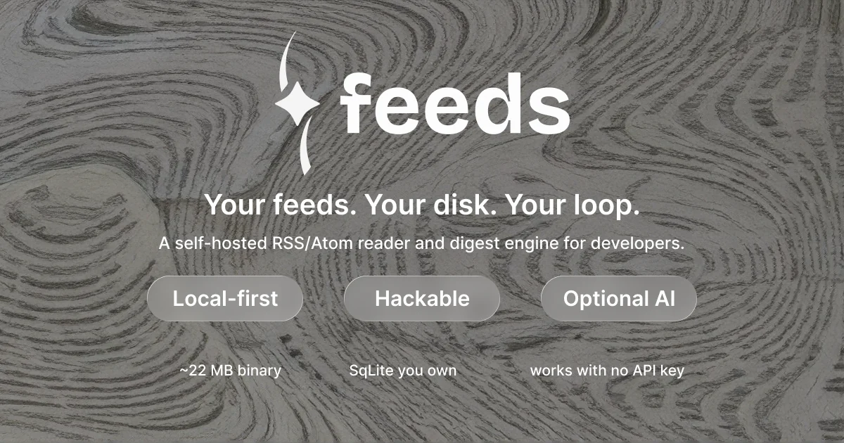
The hero, built from the kit — topographic pattern, the paper lockup, and the positioning line the whole identity was drawn to carry. It runs on the site and at the top of the README.
- Digest email reskinned so the daily send looks like the product it came from.
- Marketing site rebuilt on the palette, type scale and patterns.
- README hero and app screenshots re-shot against the refreshed UI.
- Favicon, social card and the brand-kit icon set, drawn to the same grid.
05 — What I'd take from it
Handover is the design problem
The interesting constraint on Feeds wasn't drawing the mark. It was that the system had to keep working after I stopped touching it, in the hands of someone whose job is the engine, not the interface. Every decision on this project bent toward that — ratios instead of vibes, four named don'ts instead of "use good judgement", a contrast floor instead of a preference, and a reference implementation in the repo instead of a PDF.
It's also the clearest case I have for working across the whole thing. The same spark ended up on a screen, in an inbox, on a sticker, and on a printed runner at a booth — and the only reason it holds together is that one person specified it and then went and applied it.